How to fix gaps, awkward spacing and line-ups in your seamless patterns
Overcoming challenges in surface pattern design: Part 3

We're on our final post of the series 'Overcoming challenges in surface pattern design' and in this post we will focus on how we fix:
gaps
awkward spacing
line-ups
These issues are common to all surface pattern designers, whether you're just getting started or you've been designing a while and part of the skill of being a good surface pattern designer is being able to spot them and fix them!
While that maybe easier said than done, the more your practise, the better you'll be at spotting them, anticipating them and fixing them when you do see them.
So we'll first start by looking at what each issue is, and then I'll give you some tips on how to fix them if you see them in your patterns.
Gaps
A gap in a pattern is just a section of negative space that is disproportionate to the negative space in the rest of the pattern. Can you spot the gap I was unhappy with in this pattern? (It's quite subtle - I'll reveal the answer later on!)

Awkward spaces
Awkward spacing is very similar and usually means there are bigger gaps in some places and in other places motifs are closer together or even colliding. The result is that the pattern doesn't look balanced.
You can see below a scattered snail pattern. The snails are not evenly distributed - some are close together and others far apart meaning it creates some awkward spaces in some areas and doesn't look like a finished or balanced pattern.

Line-ups
Line-ups happen when several motifs sit in a straight line without you realising it. Whether they're lined up horizontally, vertically, or diagonally, these accidental rows can distract the eye and make your pattern look less flowing and organic.
I discovered a subtle line-up in this pattern recently and had to rework it as it was really bugging me! Can you see the line up? (Again, I'll reveal the answer later on and how I fixed it!)

So, what can we do about it when we find any of these issues affecting our patterns?
Fill awkward spaces with small 'filler' motifs
In the example I shared earlier, this was the larger gap that I wasn't happy with. It's subtle, but the space between the motifs is noticeably bigger here than in the rest of the pattern. Because it creates a vertical strip of empty space, my eye was immediately drawn to it.

In this case, there was a very easy an obvious fix. The gap wasn't big enough to add any of the smaller motifs I'd been using such as the little flowers, but I was able to increase the size of both the pineapple and the leaf in order to close up the gap:

But what happens when you notice a number of odd gaps in your pattern, and you're not able to change your motifs to close up the gap?
Rather than stretching or moving your larger elements into unnatural positions, consider adding small filler motifs.
Simple shapes such as dots, dashes, tiny leaves, stars, berries, or little flowers can help balance the composition and guide the viewer's eye around the design.
You can see two patterns below where the spacing isn't quite regular, with some odd gaps here and there,

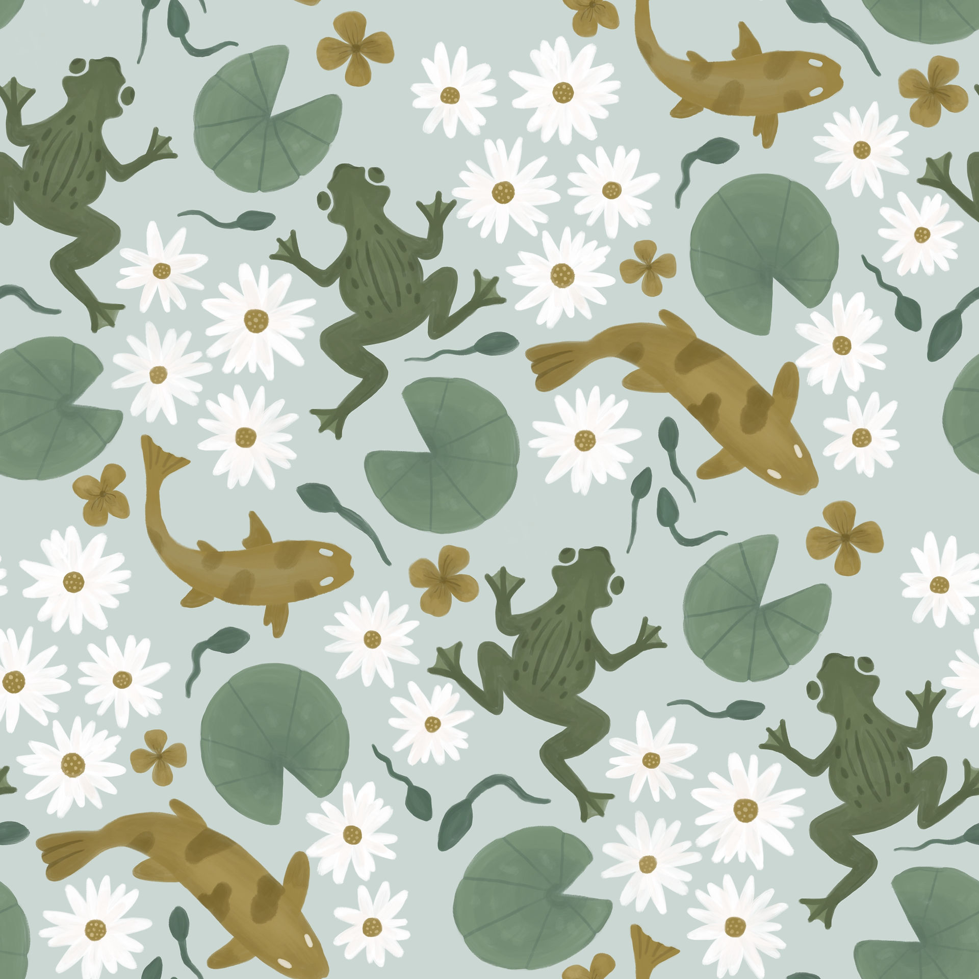
To even this out, I decided to use some simple dots in the spaces of the lemon pattern and some little petals in the pond pattern.


To my eyes, the result is a much more balanced and cohesive pattern!
Depending on the motifs in your pattern, you could use all sorts of little filler motifs to even out the gaps.
Test your repeat early and often
One of the easiest mistakes to make is waiting until the very end to test your repeat.
Instead, check your pattern throughout the sketching stage. This allows you to spot awkward gaps, crowded areas, or motifs that need repositioning before you've spent time refining your artwork.
It's much easier to change and add things at the sketching stage than when you have spent time inking your design.
If you're using Procreate, it's important not to move and transform objects once you have inked them as they will lose quality the more you do this. Moving things at the sketch stage doesn't affect the final quality.
Zoom out from your pattern regularly
What I mean by this is regularly make a smaller version of your repeat so you can see what it looks like when repeated a number of times. Sometimes a simple repeat block isn't enough to notice a line-up of elements.
Take this pattern below. In its original repeat block in Procreate, it all looked fine to me!

When I scaled it down to see what it looked like it became obvious that there was a line-up of motifs - can you see it?

The combination of the green rectangle behind the pineapple and the straight edge of the watermelon created a vertical line down the pattern which seemed to cut it into vertical sections.
If I hadn't zoomed out, I wouldn’t have noticed this, so zooming out regularly is a must to ensure you can identify this problem and fix it!
So how did I fix it?
I had to go back to the original pattern tile and redraw a few motifs. You can see that I offset the vertical lines by making the watermelon slice thinner so the angels were different and added a lime slice at a different angle.
I also changed the fruit above the pineapple (not sure what this fruit was anyway!?) into a glass that cut right into the line that had formed.
As you can see, the result is a much more organic and free flowing pattern without being chopped into vertical sections.
Use a template to get even spacing.
You may know me well enough to know that this would come up at some point in this post! But yes, I LOVE a template and use them all the time in my own design process.
For an evenly scattered pattern, using a template such as this one is a game-changer as you can totally forget about the spacing issues as it is already worked out for you.
This is the 'non directional 1' template from my 'Pattern Templates: Pack 2'

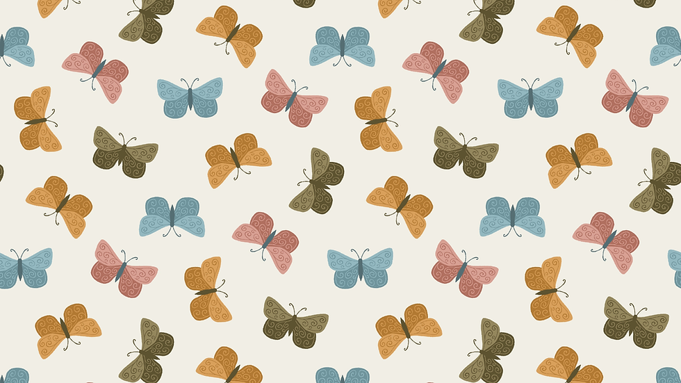
I also use templates as a guide for the main motifs and then I fill in smaller motifs afterwards. This makes for a much more balanced pattern, where I know the main motifs are going to spread out evenly.
The pattern below features in my first collection for Cloud9 fabrics and was made using the 'Simple 1' template in my 'Pattern Templates: Pack 1'

I hope this post has given you some ideas for how to avoid spacing issues and line-ups and how to fix them if you do find them in your patterns!
I don't think these issues ever go away for surface pattern designers, but the more you practise, the easier it is to avoid them and fix them quickly when you spot them!
If you have any further questions, don't hesitate to leave a comment in the comments box below!


Thank you. Easy to read and understand so i now understand the things that im seeing thats bugging me! Do you have a favourite brushset for drawing you can recommend?
Thank you so much - this was incredibly helpful. I really appreciate your generosity sharing all of these tips - and I love using your templates!